Mission and Vision
As an open designer, I feel an urgent need to involve society at large in addressing currently relevant problems. For my project Blindly Organised, I visited a senior care home in order to register the experiences of residents. I then applied this knowledge in a design for a new target group.
‘Blind people shouldn’t be treated any differently than other people.’
Marijke (28) works as a telephone operator for Telfort. Her eyesight is only 5%. She is good at multitasking and improvising. She also has a very good memory. These qualities help her in her work and daily life.
Sophie
My name is Sophie. I’m a social lifestyle designer with a particular interest in open design. I address social challenges and aim to directly involve people in an open designing process. I do this through methods such as in-depth interviews1 and users as designers.2 The media I use are photography, graphic design and product design.
For my project Blindly Organised, I researched how the knowledge developed by blind and visually impaired people can be useful to others. My research question was:
How can the systems of organisation used by blind and visually impaired people be made relevant for people in need of more structure in our society of sensory overload?
In today’s busy and chaotic society, many people experience an overload of information stimuli. In this digitised world there is a widespread need for organisation, tactility and fuzzy materials, according to the Dutch trend forecaster Lidewij Edelkoort.3
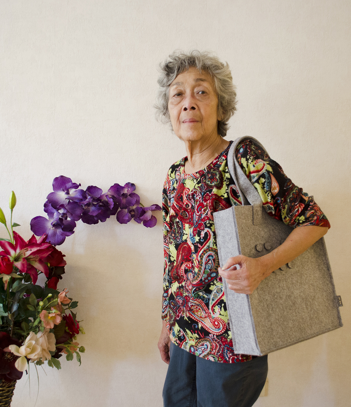
The visual disability of blind people also provides them with an advantage: they are very good at distinguishing main issues from side issues, at organising things and at systematising their lives. Blind people can help other people develop structure, focus and order. For example through redundant organisation, a system based on contrasting tactile points of reference. Julia also makes use of this system. She organises the objects in her bag in a number of smaller bags that can be easily recognised by their shape, texture, location and contrasting colours. Julia plays a key role in my research.
Open Design
How can the knowledge of organisation developed by blind and visually impaired people be applied for other people? Open design allows me to share this knowledge and thus to arrive at a new design.
‘I wish to live as normally as possible, with as few special provisions as possible, so that I don’t stand out.’
Melvin (21) lost his eyesight as a teenager.
Open Design
is a design approach that focuses on involving users and sharing knowledge during the design process. I applied this design method within my research and final product: the process is open and the final product can be personalised.
Blueprints of products are shared worldwide by fab labs. Also, it was recently decided to make scientific articles available free of cost from 2020 onwards. These developments could make a huge difference in the field of self-organised personalised care. The principles of open design played a key role in formulating my research question. How can knowledge of the systems of organisation used by blind and visually impaired people be documented and shared?
Users as Designers
In my research I applied a number of open design research methods, focusing on the feedback of blind and visually impaired people. Users as designers is a groundbreaking and efficient open innovation system. Users are closely involved in the design process and asked for their daily experiences or critical feedback. The user, in this case a blind or visually impaired person, is seen as an expert. Another method is the memory palace,4 an interview technique that makes use of visual imagination in order to remember things more easily. Simple mnemonic devices which many people use are based on the method of loci:5 abstract or unknown ideas are linked to familiar locations.
JULIA, a unique system of organisation
Julia, a visually impaired elderly lady, has developed a personal system of organisation for her own bag.
‘Because after all, everyone is blind in their bag.’
Sophie Helene Dirven
Friendship
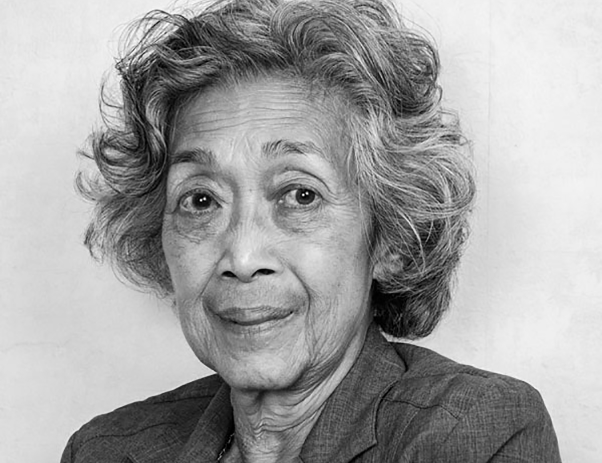
My research began during my Open Design minor, in the final year of my studies at the Willem de Kooning Academy. I met Julia in the Humanitas senior care home on the Bergweg in Rotterdam. We struck up a conversation during which she told me how she deals with her disability, and who or what helps her in this regard. This is how we started talking about her well-organised bag and her system. The next step was a personal research of Julia and her life. Through this intense contact we developed a close friendship, based on trust and sharing experiences, in which I came to know a great deal about her. Through our friendship I developed a desire to help her and to improve her system. I started searching for other systems developed by blind and visually impaired people. My goal was to bring together different sources of knowledge in order to develop the best possible system of organisation.
In-depth-interviews
The participants, Vincent, Corry, Melvin and Esther (and also Hannelore, a care professional working for VISIO, an organisation that provides support to blind and visually impaired people) told me during in-depth interviews about their everyday life, their problems and the things they enjoy. This led to the formulation of design rules for the JULIA bag, the final product of my minor. The next step was to test the JULIA bag (with prototypes for the systems, colours, materials and small bags) with Jody and Ellen. This allowed me to further improve the design rules for the final design.
System of organisation
During my graduation project, I applied my findings in the design of a system of organisation: the JULIA bag, based on Julia’s needs and feedback. The docking station is a place for reorganising the JULIA bag. Usually, a docking station is a device that brings together electronic ports (such as USB), but in this case it is a place for bringing together the components of the bag. The JULIA bag and the docking station together constitute the final product of my research. Because after all, everyone is blind in their bag.
Blind
About Julia, the other blind and visually impaired participants, and applying their knowledge of organisation.
‘Design feels good, even if it’s not always so practical.’
Vincent (50) believes that people who are not visually impaired should also be able to experience the advantages of tactile comfort.
Experts
I involved a number of blind and visually impaired people in my research, following the users as designers method. These experiential experts shared with me their own systems, their everyday life and their problems, and provided me with feedback on the JULIA bag.
I have focused particularly on the experiences of Julia and Vincent, who played such an important role in the entire project. This chapter introduces them, their systems and their knowledge.
Julia (80) lives in a senior care home. Her eyesight is currently no more than 5% and gradually decreasing. In her daily life she first relied extensively on colour contrasts. Nowadays she does everything more and more by touch. Julia puts everything in little bags, which contrast with the background through their shapes, colours and materials. This is how she can find her belongings, at home as well as in her bag. She organises the objects in her bag using colours, shapes and locations; small bags within a bigger bag.
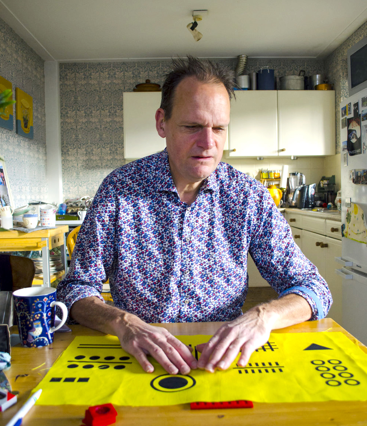
Vincent (50) is a comedian and writer who considers himself very chaotic. He hates products that are specially made for blind people. He prefers design products, even though these are not always so practical, and believes that people who are not visually impaired should also be able to experience the advantages of tactile comfort. In an interview6 he told me that shapes and colours alone are not sufficient as principles for organisation. This led me to add a new element of recognition: texture, also known as tactility.
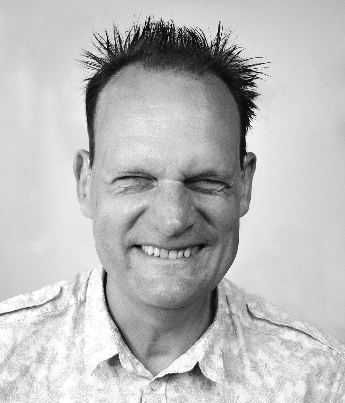
We can all learn something from Vincent. In order to learn a new route he walks it ten times in a row, making a mental map similar to the memory palace. I also applied this method during the interviews. The systems people use have often become habits, to such a point that they are no longer aware of them in their everyday life. During my interviews, the subjects were asked to picture themselves walking through their house, remembering and describing the systems they use.
Compulsively learning structure
Hannelore, who works at VISIO, says that most blind and visually impaired people need to compulsively learn structure. In order to recognise objects, they develop their own system based on contrasting colours, shapes and materials. Hannelore advises people to keep their belongings to a minimum and with fixed locations, categorised according to themes, uses or functions.
Blind and visually impaired people often use the memory palace in order to follow a route; their memory is well-developed through continuous use. They also have strong tactile and auditory faculties, as well as a keen sense of smell. But blind and visually impaired people also enjoy beautiful design, not only functional products.
In in-depth interviews, four of these six blind and visually impaired people said that their disability had forced them to live in a more organised fashion. A chaotic lifestyle would simply be impossible. Maaike: ‘When I still could see, I was very chaotic. Since I’ve become visually impaired, I need structure in order to find things. All of my belongings now have fixed locations, in my house as well as in my bag.’ 7 Vincent thinks otherwise: ‘Not all blind people are well-organised; that’s actually a stereotype.’ 8 Still, the interviews show that blind people are experts of organisation. Those who lost their eyesight at a later age often had to compulsively learn to be organised.
Organised
A comparison between the knowledge developed by blind and visually impaired people, and that of organising coaches and scientists.
‘Not all blind people are naturally well-organised; they often had to learn this in a compulsory way out of necessity.’
Hannelore (56) is a care professional at Visio, an organisation that provides support to blind and visually impaired people. She herself is not blind or visually impaired.
My preliminary research showed that the knowledge developed by blind and visually impaired people can be summarised as: systematic, consistent, well-organised and tactile. How does their expertise and knowledge compare to existing principles and systems of organisation?
Organisation according to the coaches
Are there any overlaps between the knowledge of professional organising coaches and that of blind and visually impaired people? How could this combination of knowledge be useful in designing systems of organisation?
Designing structure
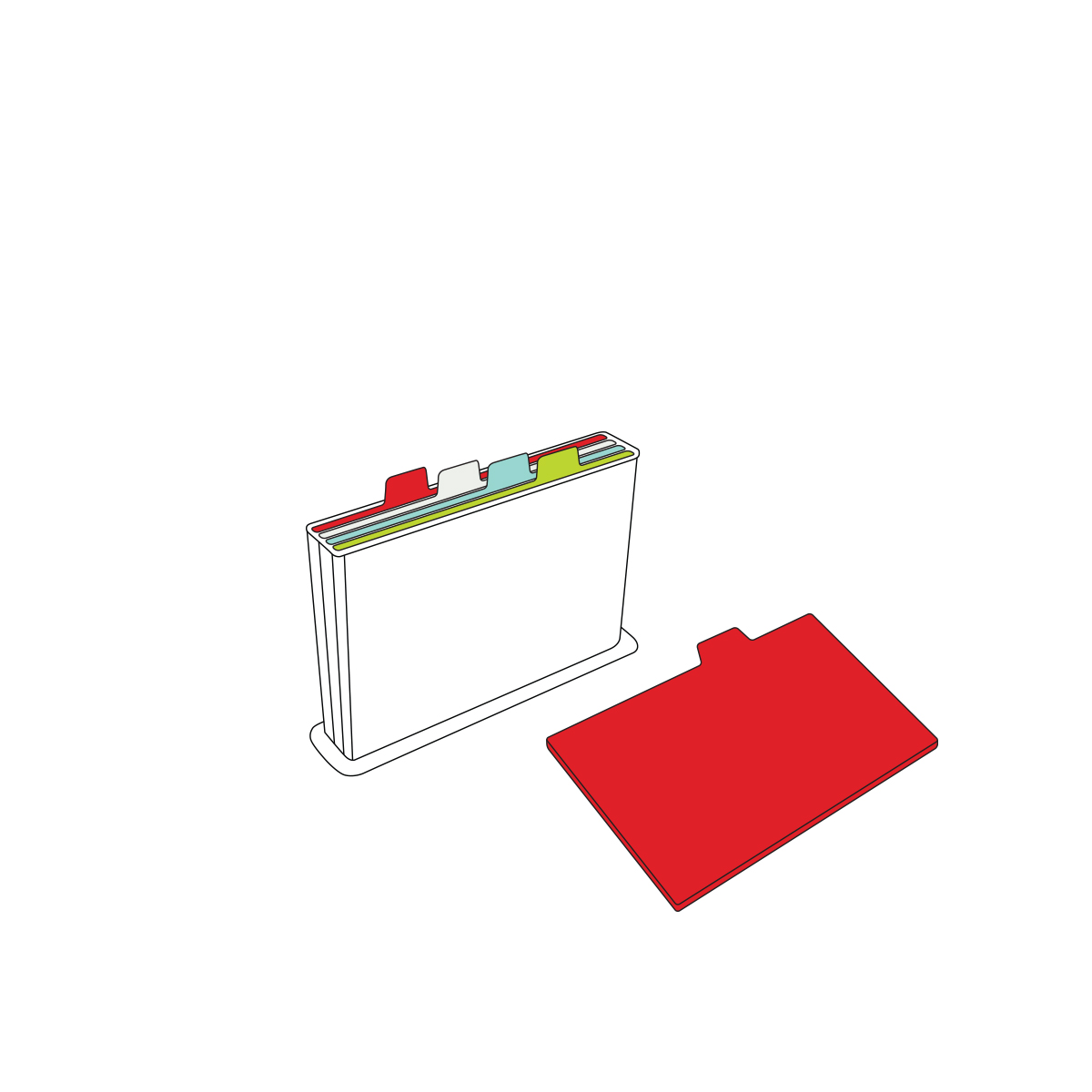
An organising coach is someone who helps people bring structure into their lives. I interviewed the organising coaches Els Jacobs9 and Ingeborg Koot10 about the systems of organisation they use, as well as the key rules of organising. These are similar to the systems used by blind people: both make use of the ABC system (location A is used for storing everyday objects, location B for weekly objects and location C for monthly objects); and both are consistent in the need to put things back in their place and to reserve fixed locations for things that are used every day, the ‘home base’. The main difference is the manner of recognising objects: blind people rely on their sense of touch, while the coaches rely mainly on the sense of sight. The system of organisation developed through this research can be used by blind people as well as other people. Thus, blind people could easily work as organising coaches.
Hand-mind coordination: proprioception
My final product also makes use of the sense of proprioception.11 According to Charles Scott Sherrington’s research of the nervous system, our bodies unconsciously (and blindly) know where our limbs are located in relation to the rest of the body. Participants in Sherrington’s experiment were blindfolded; one of their joints was kept at a certain angle for a certain period of time, before being brought back to a neutral position. Then the participants were asked to repeat this process. The experiment showed that people were able to correctly identify the angles. This principle is called proprioception. In this regard there is no difference between blind people and other people; thus the same design rules can be applied for both groups.
The magic number
According to the psychologist George A. Miller, a person can easily remember no more than seven things.12 However this is also dependent on one’s brain capacity: a person of above-average intelligence can easily remember seven things, a less intelligent person perhaps no more than four. For example, a person who goes shopping without a shopping list can easily remember seven different products.
I applied these two principles in my design as follows:
The dimensions of products must be in proportion to the reach of our arms (proprioception, Charles Scott Sherrington).
The product may include no more than seven small bags (George A. Miller).
Systems of organisation in the design
For my final design, I also researched the systems of organisation used in various products. I did this from the perspective of blind and visually impaired people, organising coaches, and scientists (Sherrington and Miller) – as well as my own personal vision. I have explained here the two most relevant perspectives.
Testing process
Following the users as designers method, I tested a number of prototypes together with blind and visually impaired participants.
‘For me the focus is always on safety and functionality, but it should also be trendy.’
Corry (54) works in elderly care, and recently became blind in one eye. Corry relies on contrasts in materials and colours. Although the main focus for her is on safety and functionality, she also enjoys trendy products.
While testing the prototypes, I also conducted in-depth interviews in order to compile the experts’ opinions. Based on these opinions I was able to optimise the design rules.
Organisation
I also asked the participants about their own systems of organisation. Since these systems have often become unconscious habits, I made use of the memory palace, inviting interviewees to mentally walk through their house and remember the systems in question.
A few questions
Are you a naturally well-organised person, or did you need to learn this out of necessity?
Do you have your own personal system of organisation / finding things back?
Could you give an example of this?
For example, start in the hallway and imagine yourself walking through your house.
Materials
The participants were involved in every stage of the design process. The JULIA bag was tested together with Jody and Ellen, focusing on the model, the system, the materials, the tactile shapes, the layout, and any other possible points for improvement. I had already selected the prototypes and materials based on their tactile properties.
Research of systems
Based on the knowledge developed by blind and visually impaired people, I proposed three new systems and a variety of materials to the two participants. Characteristics:
- snap fasteners
- holes
- velcro
This test indicated that participants preferred the velcro system, which allowed them to organise their belongings quickly and freely. The snap fastener system turned out to be too complex: participants found it difficult to locate the fasteners. The holes-based system did not work well because participants were afraid to get snagged in the holes.
Results
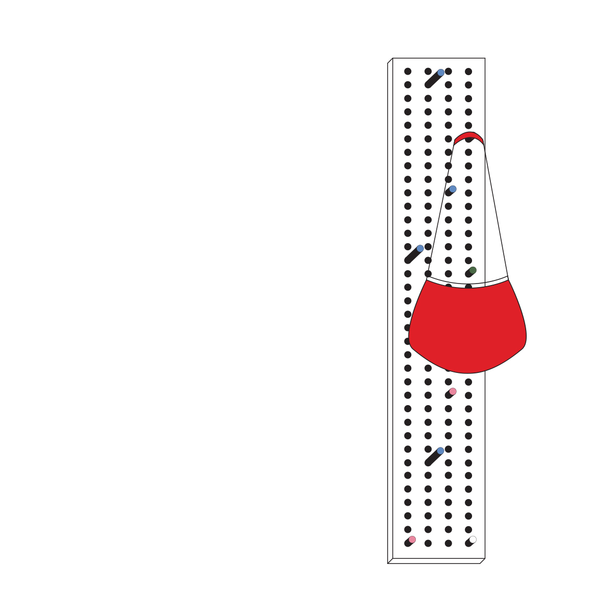
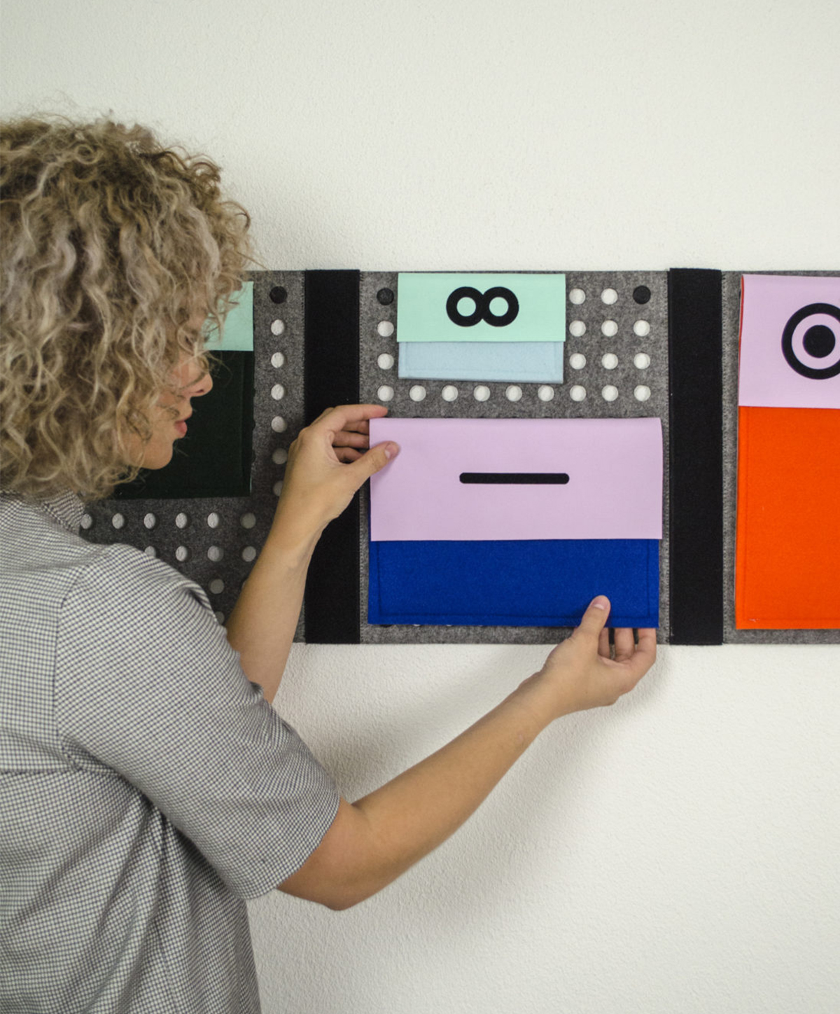
Both the bag and the docking station needed to be tactile. Participants preferred soft or smooth materials. Based on these findings, I developed the design rules for the JULIA bag, a system that includes a number of small bags in which users can organise their belongings based on colour, shape, location and texture. The bag can be personally optimised according to one’s specific disability, using contrasting colours, shapes and dimensions, and based on a digital blueprint.
Practical requirements
Testing of the prototype showed that the following characteristics were important for the bag:
Compartments with zippers.
Leaving hands free for the white cane and the guide dog.
Light, compact and weather-resistant: with fixed locations, but also redundant in such a way that the user can easily distinguish top from bottom and front from back.
Personally customisable and trendy: not recognisable as a ‘blind people product’.
The materials research with Jody and Ellen indicated that the design should feature distinctive shapes, colours, textures and contrasts.
‘For my clothing I have my own system. I own a lot of basics that are very much alike. For every shirt colour I have a different mark of recognition. For example, I hang my blue shirts inside out; I cut the washing labels out of the red shirts, and the brand labels out of the black shirts. This way each colour has its own mark.’
– Ellen Koudijs (40), 2017
‘My personal care products easily get mixed up. That’s why I now use plastic freezer bags. This allows me to thematically organise my products.’
– Maaike (27), 2017
I applied the knowledge and feedback of these participants in defining the criteria for the final design.
Design
When you consider the knowledge of organisation developed by blind and visually impaired people as a starting point for a design, you see and treat them as experts rather than as a minority. Blindly Organised is an example of such an approach.
Knowledge of organisation
How can knowledge of the systems of organisation used by blind and visually impaired people be made relevant for people in need of a more structured life in our society of sensory overload?
Minorities as experts
My goal was to compile knowledge of the systems of organisation used by blind and visually impaired people, and make it available for a broader target group. By seeing them not as a minority but as experts of organisation, they become not only users but also designers. Their knowledge provided the starting point for my design: a clearly organised, convenient and redundant system of organisation that can be used at home as well as in the user’s bag. This design makes no distinctions between blind, visually impaired, or other people. It is for everyone who might benefit from more structure.
Rules
I combined the knowledge of these experts of organisation with that of organising coaches and the scientists Miller and Sherrington – as well as my own vision which I had developed during the Open Design minor. This led me to define rules for providing a clearly organised and consistent structure. These all come together in the JULIA system, a bag with a docking station.
Personally functional
The bag should provide a clearly organised structure, while also leaving the user’s hands free for the white cane and the guide dog. The bag should be light, compact and weather-resistant: the bag should provide fixed locations; and the small bags should be closable and redundant (recognisable by their colour, texture and location). Finally, the product should be trendy and not in any way recognisable as a product designed exclusively for blind people.
Customisable
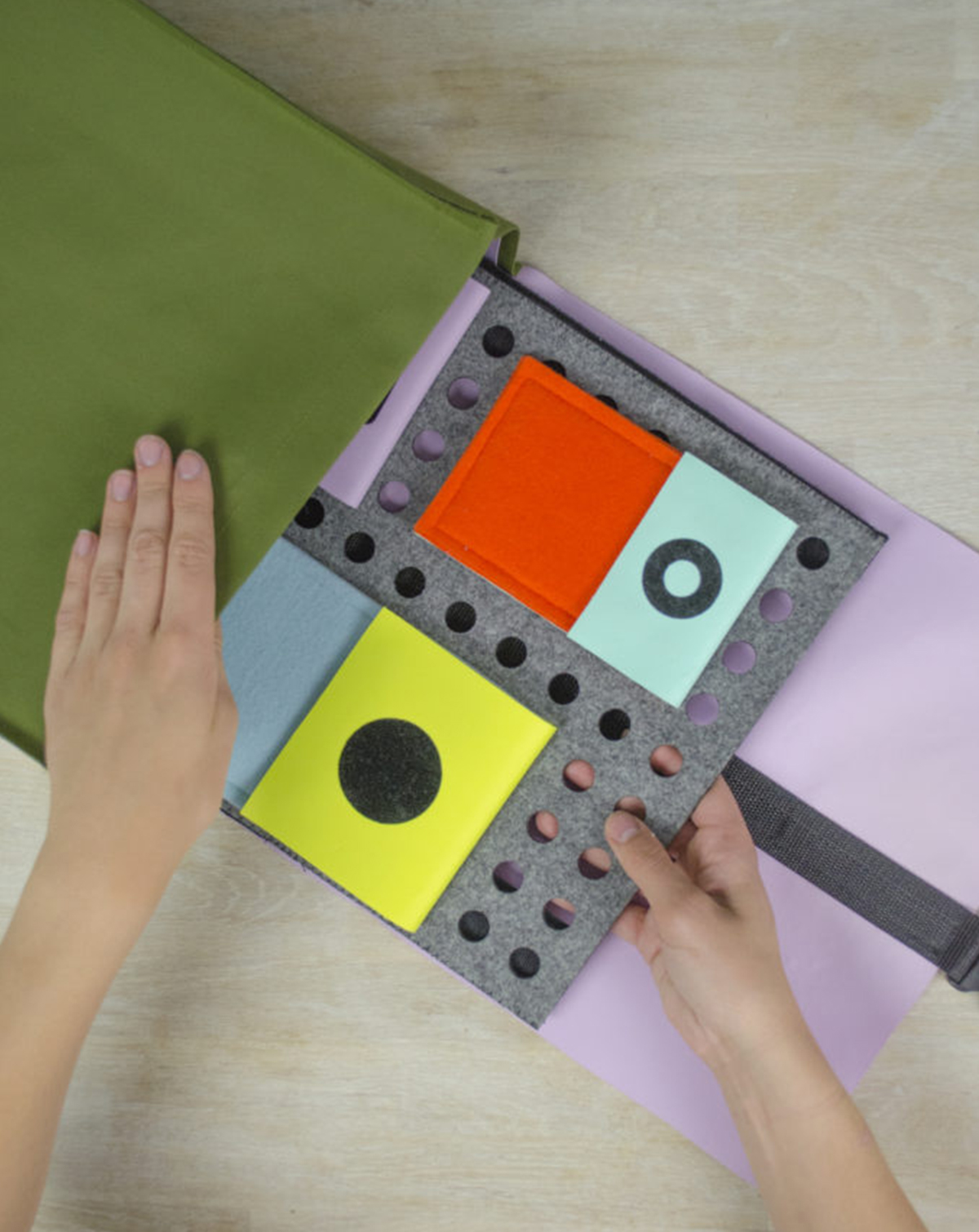
The bag is a customisable system that includes an assortment of smaller bags. The compartment for the telephone can also be used as a phone case; the pen compartment can be used as a pencil case or toiletry bag.
Docking station
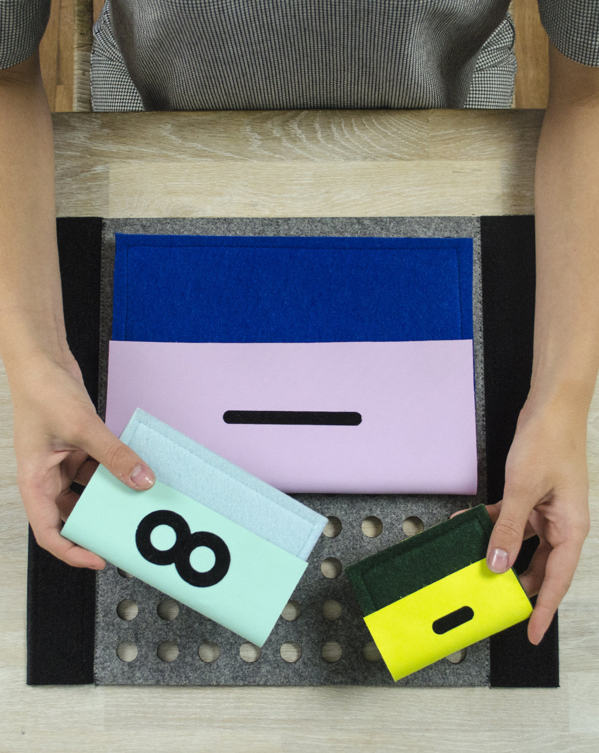
The JULIA bag comes with a docking station that allows the user to organise their belongings according to the ABC system used by organising coaches. Belongings are assigned a fixed location in the house: an insight used by blind and visually impaired people. This location is the starting and ending point of each day. Here the user can arrange, pack and unpack their bag.
No more than seven
The format of the docking station can be personalised (proprioception, Sherrington). The compartments in the bag are redundant and can easily be recognised by their textures, shapes and locations. The user can bring along no more than seven compartments (George A. Miller’s vision of the number seven and short-term memory).
Rich in contrasts
The system makes use of contrasting colours and materials; colours can be distinguished even by visually impaired users. For example, light blue contrasts sharply with deep orange, since a light colour contains more white than a dark one.
Design principles
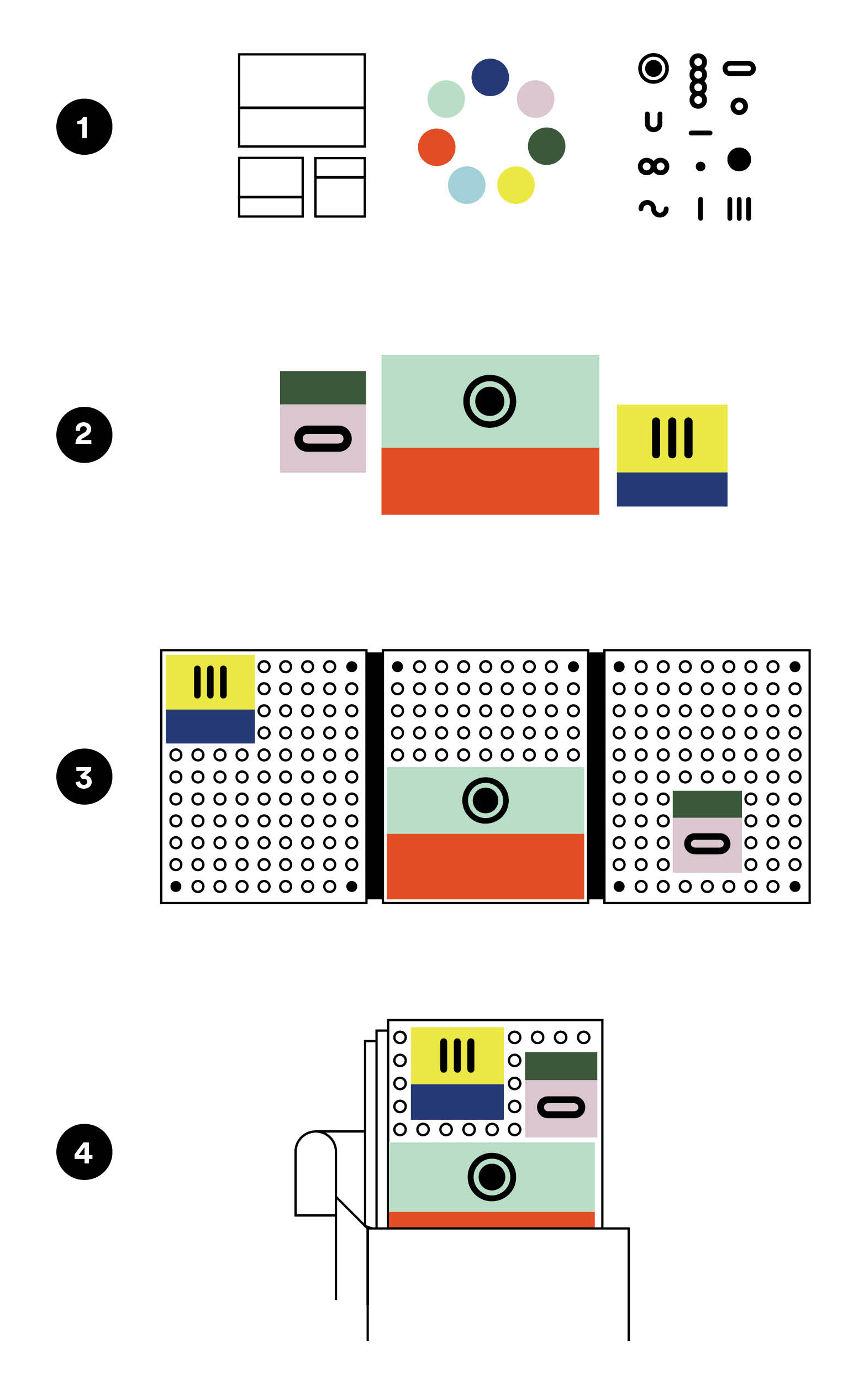
- design vision
The bag can be personalised based on the user’s wishes, by downloading the blueprint of the design (see poster/cover). - requirements for the products
The size of the docking station is determined by the concept of proprioception, and the bag has no more than seven compartments. - function of the products
The bag and the docking station should provide fixed, consistent, recognisable, well-organised and clearly defined locations for blind and visually impaired users. - shape of the products
The final product should be a ‘home base’ that meets the requirements of the ABC system used by organising coaches.
We should not limit ourselves by excluding the valuable knowledge of blind, visually impaired, or any other people. Their disabilities have in fact allowed them to develop solutions which we as designers can learn from. This should be the foundation of every design; it provides a relevant starting point for developing suitable design solutions. If a concept actually works for someone with a disability, then it should also work for the rest of society.
Limiting is the new organising!
Colophon
Hybrid Publishing
This publication was developed by Hybrid Publishing, founded by the Willem de Kooning Academy as a means of profiling and disseminating outstanding research conducted by its students and teaching staff, whether independently or in collaboration with external partners. Researching and experimenting across a broad range of processes native to digital and analog media, WdKA Hybrid Publishing fosters novel approaches to design, authoring, reading and dissemination made possible through ongoing developments from the legacies of Gutenberg’s press to present-day technologies.
HP Research Awards
The HP Research Awards series showcases the work of recipients of the Willem de Kooning Research Award. Established by the Willem de Kooning Foundation, the awards are granted to outstanding students whose graduation projects and research have helped provide new insights to broader audiences.
For a digital version of this and other publications, go to at.wdka.nl/hpresearchawards.
Colophon
Blindly Organised © 2018
at.wdka.nl/hpresearchawards
Developed by Hybrid Publishing,
Willem de Kooning Academy
Text © Sophie Helene Dirven (sophiehelenedirven.nl)
All rights reserved
ISBN 978-94-92479-08-2
Author: Sophie Helene Dirven
Editor: Deanna Herst
Translation and corrections: Johanna Monk
Coordinators: Loes Sikkes and Kimmy Spreeuwenberg
Design: Amy Guijt (amyguijt.nl)
Developer: Lucia Dossin (luciadossin.net)
Printed by: Pantheon Drukkers
Reading (Dutch): Vincent Bijlo
Reading (English): John Carrington
Thanks to:
Vincent Bijlo, Justus Tomlow, Cory, Melvin, Esther, Hannelore, Marijke, Maaike, Patricia, Bastiaan, Ellen
Special thanks to Julia, my inspiration and third granny. I’m so glad I met you!
Download